MASTER'S THESIS
Maps for Decision Making
Designing digital map interactions to support long-term decision making on choosing a neighborhood to live
Final Prototype Animation
Introduction
People have long consulted maps as references for structuring and building their knowledge about unfamiliar places. Today, popular digital mapping and navigation tools (Google Maps, Yelp, Garmin, etc.) increasingly assist users with short-term decision making, from choosing a nearby restaurant for dinner to deciding on the most convenient way to get there. However, when users look to digital maps for assistance in making long-term decisions, the design of such systems must accommodate more complex user behaviors and activities over longer periods of time.
This study investigates how young adults decide where to live when moving to a new city, and how the design of digital maps might better facilitate this process. Hence, the thoughtful design of digital mapping and planning tools that allow users to externalize and prioritize their preferences in response to information throughout the process has a good chance of increasing a user’s engagement with such critical decisions as choosing a location to live.
Primary Research Question
How can interactions with digital maps inform a young adult’s choice of choosing a neighborhood to live?
Sub-Questions
How can a system combine different data sources in ways that support decision making using self-ranked variables?
How can digital maps reflect and combine the lifestyle choices of different users?
How can a system encourage evaluations of long-term outcomes resulting from choices of place?
Literature Review
Millennials are a mobile audience
This investigation focuses on the millennial generation, people roughly between the ages of 21 and 34. I chose to focus on this age group in the United States because, despite being the most diverse generation (Krueger, 2013), members of this cohort appear to share many preferences and tolerances that are markedly different from past generations. Many inherit high debt from college expenses, and quickly look for employment in cities and urban areas, hoping to both earn and save money soon after graduation (Fulton, 2012). According to a 2013 summary of the preferences of Millennials, the American Public Transportation Association (APTA) concluded that many in this generation are moving to so-called millennial “hot-spots;” cities such as Boston, Chicago, San Francisco, Seattle, Portland and Washington D.C. Additionally, more young adults delay the move out to the suburbs until their mid to late 30’s, if at all (APTA, 2013).
This marks a distinct shift in preferences from suburban, drivable communities towards walkable, urban neighborhoods, according to the 2013 Urban Land Institute’s report on urban growth patterns in the United States (Krueger, 2013).Generally speaking, young adults prefer living close to downtown areas, as well as easy access to local businesses through a variety of public transportation modes. Whereas in previous generations, owning a car was seen as a “coming-of-age” rite, to Millennials in the city, cars are viewed as a “hassle” (Filisko, 2012). Others attribute this transportation preference to Millennials wanting to spend a minimum amount of time commuting, unless they can simultaneously multi-task, either through texting, exercising, or socializing (Filisko, 2012). Moreover, by the time they decide to move to a city, Millennials have yet to reach their full earning potential, and many are not yet ready to have children, so an emphasis on living near good school systems is not a high priority (Hudson, 2013).
Decision-making strategies can be complex and diverse
Many cognitive and behavioral psychologists study and propose theories about human decision-making processes. Thomas Princen, Associate Professor at the University of Michigan School of Natural Resources and Environment, for one, resists the idea that humans are naturally short-term thinkers. Instead, he claims that there is both biological and physiological evidence that our ancestors exhibited both long-term and short-term planning abilities, citing such examples as the use of fire for cultivating future crops, and the propensity for hunter-gatherer societies to raise families in multi-generational households (Princen, 2009). But in modern, consumerist societies, he argues, there is a shift in focus towards celebrating abundance and concern for the “new,” and thus, the immediate often overrides the ability to plan for the future. Because the future is cognitively flexible (“anything could happen”), people can be manipulated into focusing solely on the immediate (Princen, 2009). A goal of this investigation is to see how design can help shift a user’s focus towards long-term planning.
In addition to the situational differences among recent graduates, each person may approach long-term decision making in a variety of ways. Some may try to gather all possible information before choosing the option that offers the greatest potential. Others may follow what Princeton University professor of psychology Daniel Kahneman describes as Prospect Theory — where large decisions are fragmented into smaller ones, and each is evaluated based on contextual gains and losses (2003). Patricia Wright advocates for designers to better respond and accommodate this diversity in decision-making strategies:
“...people may differ in being visualizers or verbalizers (Mayer and Massa, 2003), in being convergent or divergent thinkers, and in the knowledge and expectations they bring to the decision-making task. It means being responsive to differences in age and language fluency, for these are known to change people’s choices about the way information is communicated (Wright et al., 2008)”
— (Wright, 2009, p. 207).
In addition to diverse cognitive strategies, users approach decision-making with a variety of emotional responses. According to Harvard professor of psychology Daniel Gilbert, people are often bad at predicting their emotional response to decisions because they fail to account for what he calls their “psychological immune system.” This, he says, is a process by which people quickly adapt to concrete decisions (Gilbert & Ebert, 2002). Instead, decision-makers try to protect themselves against sub-optimal outcomes by purchasing escape clauses, return options, or otherwise providing themselves an “out” (Gilbert & Ebert, 2002). The disadvantage to such escape clauses is that the decision-maker will then spend more time considering potential alternates to the one they already have, wasting time that could be used to make other future decisions.
Cognitive Simplification Processes
Psychologists Amos Tversky and Daniel Kahneman claim that because of imperfections in human perception, changes in the way one frames a decision often result in changes in the desirability of options (Tversky & Kahneman, 1985). Tversky and Kahneman define a decision frame as being controlled by an individual’s: a) norms, habits and personal characteristics, and b) his/her unique formulation of the problem (1985). This decision frame is important to consider when designing for a user who confronts the problem of finding a place to live in terms of trade-offs (i.e. a user may consider living in a quiet neighborhood, but then be further away from public transportation options). Tversky and Kahneman claim that people are often unaware that a different framing of the same problem can potentially affect the relative attractiveness of the alternative options (1985).
Indiana University professor of business Charles R. Schwenk compliments the work of Tversky and Kahneman. In 1984, Schwenk surveyed a multitude of decision-making theories from the 20th century and found there to be three common phases: Goal Formation and Problem Identification; Alternatives Generation; and Evaluation and Selection (Schwenk, 1984). Schwenk argues that when certain decisions are quite complex and involve a high degree of uncertainty, the human mind relies on certain heuristics, or “rules of thumb,” in order to simplify the process. Schwenk cites Tversky and Kahneman as saying that, in general, these heuristics can be useful for helping an individual make a complex decision, but they may also lead to “systematic errors” or incorrect biases with regards to the decision-making process (Schwenk, 1984). Thus, designers who are able to take such heuristics into account will be better equipped to create tools that facilitate the decision-making process.
The Analytic Hierarchy Process
A model for decision making
This model deconstructs a complex decision into a hierarchy of Goal, Criteria, Sub-criteria, and Alternatives. Each criterion is assigned a relative weight of importance by the decision-maker (often expressed as a ratio or percentage) by which alternative options are iteratively judged. The example below illustrates the application of the Analytic Hierarchy Process to the problem of finding an ideal neighborhood in which to live. (Hypothetical weights are assigned to each criteria and sub-criteria.)
Given the complexity of decision making, some psychologists go beyond describing the process to prescribing models for use. One such model is the Analytic Hierarchy Process, developed by Thomas Saaty, a graduate business professor at the University of Pittsburgh, in the 1980s.
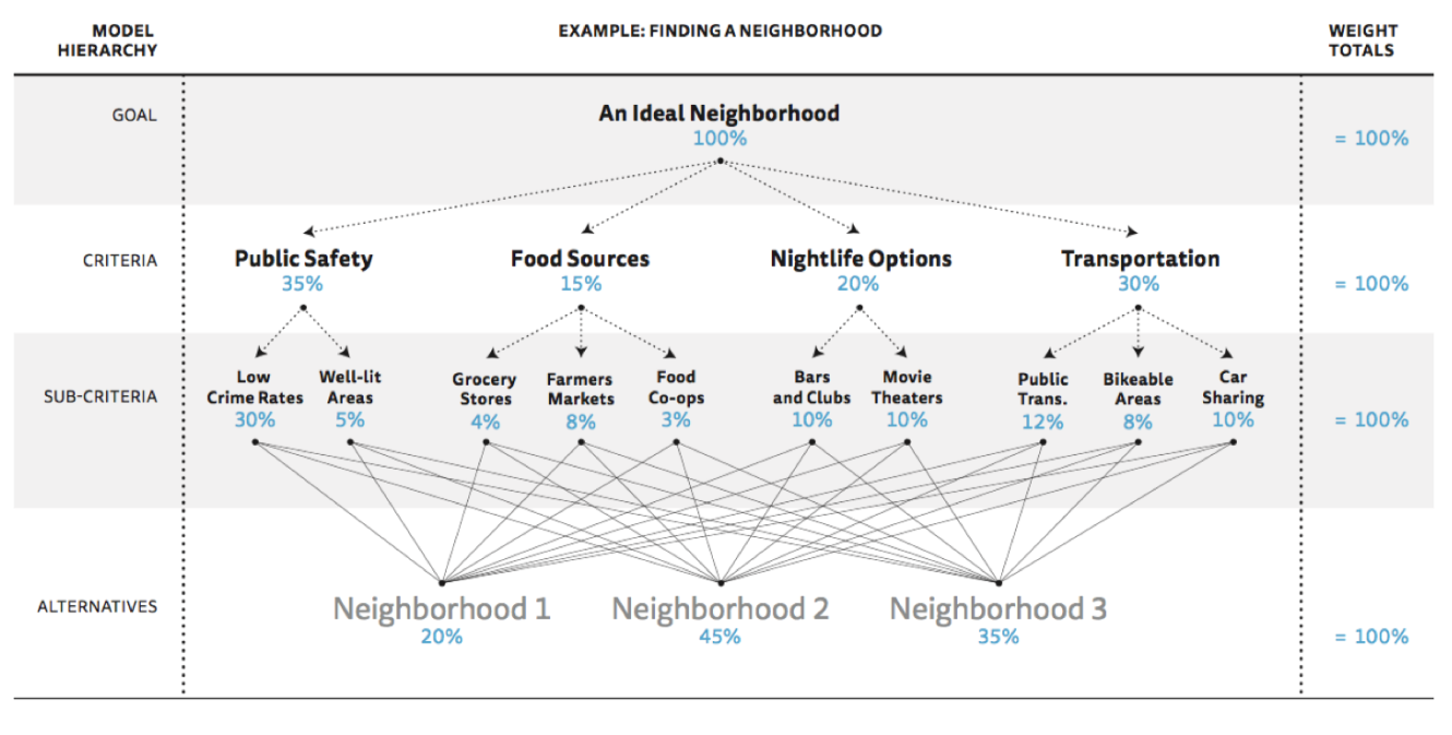
The model relies on the decision-maker’s ability to deconstruct his or her problem into a hierarchical representation of a goal, followed by various criteria for judging possible alternatives. The decision-maker ranks each criterion by weighting the variables through an iterative, pair-wise comparison of each variable as to 1) which of the two criteria is more important, and 2) how much more important it is (Saaty, 1990). This subjective exercise relies on the decision-maker’s judgment rather than detailed scales or methods (Gilb & Maier, 2005). Once all variables have relative weights (often expressed as percentages adding up to 100%), the decision-maker compares various alternatives in order to arrive at a numerically logical criteria for making decisions.
A clear advantage to the Analytic Hierarchy Process is that it gives people a systematic means of externalizing and structuring a complex decision-making process. Because the model relies on the decision-maker’s own criteria definition and relative judgment, it can accommodate both quantitative and qualitative preferences. The model also allows for each criterion to be divided into smaller sub-criterion units, if necessary.
Though this model does provide a means for visually articulating complex problems, there are a few limitations to its use. First, it relies heavily on spreadsheets and rather time-consuming mathematical processing in order to arrive at a statistically correct answer. Gilb and Maier (2005) also note that complex decisions are often made with tight time constraints and without complete information. These constraints, not the logical functions of the model, often heavily influence the decision-making process. Gilb also criticizes the idea of weighted preferences with respect to the relative importance of some criteria because preferences can change immediately after “target” levels are reached. For example, when someone is hungry, food is a top priority. Once hunger is satiated other preferences may assume a higher priority (Gilb & Maier, 2005).
The idea of forced prioritization is intriguing. This is a useful structure that the designed system can provide to the user that would allow him/her to see which preferences have the most influence over a decision on where to live.
Official & Unofficial Data Sources
Academic geographer Michael Peterson argues that although any map requires a critical “leap of faith” in order to be useful, the abundance and ease of creation for online maps means there is reason to be skeptical of any map’s information source (Peterson 2009). The sources of location-specific information cover a wide spectrum. On one end, official sources provide quantitative data and statistics about a city. Real estate agencies collect and publish housing rental prices and market activity data. Regional and local transit authorities, as well as Google and other aggregated sensory systems make available transportation data. Government agencies publish weather and environmental data, and federal and state forums collect and issue crime statistics.
Without proper expressions of certainty in information quality, the technology used to display this data can falsely present the user with what appears to be a complete picture. In his book, Picturing the Uncertain World (2009), author Howard Wainer describes several scenarios where readers draw incorrect and often costly conclusions from data, due to over-reliance on the “objectiveness” of the data visualization.
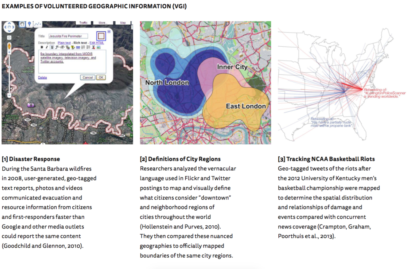
At the other end of the spectrum, user-generated information about a particular place is used to inform decisions. Michael Goodchild, a research professor at the University of California, Santa Barbara, named this particular data “Volunteered Geographic Information,” or simply “VGI” (2007). VGI is the result of large-scale engagement from social media users in the creation of online, geo-tagged content, often taking the form of images (uploaded to Flickr or Facebook, for example), or digital narratives as tweets or other social network postings. This practice creates digital translations of physical spaces as well as the human activity that occurs in those spaces. Such user-generated data proves helpful when visualized in map form, as seen on the opposite page in such cases as disaster response [1] , determining what citizens name regions of a city [2], and tracking the riots that occurred after the 2012 NCAA Men’s Basketball championship in Kentucky [3].
While these previous examples suggest audiences of local citizens, sociologists and academic researchers, they each demonstrate a core value of VGI as one that embraces a dynamic, “bottom-up” approach to digital knowledge creation of place. This contrasts with traditional “top-down” knowledge platforms from officials or experts that some argue to be static, authoritative, and reductively definitive (Sui, Elwood and Goodchild, 2013). I believe, when thoughtfully referenced and visualized, this citizen-generated content represents a potentially rich source of information for people relocating to a particular city.
While digital interfaces make it easy to assume that geo-tagged content is extensive, comprehensive and diverse, authors Graham and Zook (2013) claim there is still vast unevenness in indexed content about the world’s cultures. Studies that analyze Flickr photos near the US-Mexican border by Watkins (2012), and geo-referenced content of multi-lingual regions in Ontario and Quebec, Canada by Graham and Zook (2013), demonstrate that both cultural and linguistic differences — even within close geographic proximity — create varying amounts of information and fundamentally different representations of place. As a result, they claim, “... places are increasingly defined by dense and complex layers of representation that are created, accessed and altered via digital technologies and often opaque lines of coded algorithms,” (2013).
Such linguistic and cultural variations, combined with user-centered, computational search algorithms may prevent users from accessing content from a variety of information sources.As both official and user-generated geographic data becomes more readily accessible to digital users, it will be evermore crucial for users to assess information quality. Despite its benefits, VGI still poses significant limitations in accurately representing activity in physical places. Authors such as Crampton (2013), Graham (2011) and Hale (2012) advocate for a cautious approach to VGI data analysis. As one example, computer algorithms that assign geo-tags can be inaccurate or incomplete, referencing the location of a user’s profile instead of the actual location where digital content is created. Thus, in aggregate, the information may not always be an accurate proxy for the activities of a particular place (Hale, Ga ney and Graham, 2012).Hollenstein and Purves (2010) argue that people think and reason about geographic locations in vague terms. While our technology is capable of recording information in precisely calculated distances and geo-spatial coordinates, the human mind conceptualizes space in less-defined, often hierarchical ways.
These vaguely expressed relationships often take the form of “near the park,” “downtown,” or “on Wade Avenue” in online annotation. While these definitions may come into conflict with official or more precisely defined legal boundaries in various media, they are still crucial for communicating geographic information at multiple scales through language (Hollenstein & Purves, 2010). Hollenstein and Purves continue to explain that there are areas of agreement and disagreement among citizens and officials with regard to what areas are called: “Typically, there will be locations that are clearly agreed upon as being part of a place, perhaps situated towards the center of an associated region.
However, there will often be uncertainty and disagreement on locations towards the fringe that might be less characteristic,” (2010). These names and designations, they say, are in constant transition. Hence, for purposes of investigating a city remotely, a user must have the opportunity to combine a range of precise and vague descriptions. Thus, digital map interfaces that attempt to present multiple sources of information must present the user with the necessary tools to aggregate, assess, and verify such language and knowledge. In the case of deciding where to live, users need to be able to compare abstract, official data with a variety of citizen-generated knowledge.
Conducting the Survey
In order to better understand the variety of preferences and decision-making strategies of individuals, I conducted an online survey using Google Forms over the course of one week. The link to the survey was sent to 80 people and included both free-response and Likert-Scale questions regarding respondents’ most recent moves. These questions ranged from ranking various preferences in the characteristics of places where they wanted to live, to describing the various resources they used throughout their decision-making process.
RESPONDENT DEMOGRAPHICS
In total, 51 people (28 female, 23 male) took the survey and offered a range of preferences, decision-making resources, and strategies. Respondents traveled a wide range of distances for their last move. Many moved from cities to other cities, with a few relocating to less-populated areas.
RESOURCES CONSULTED
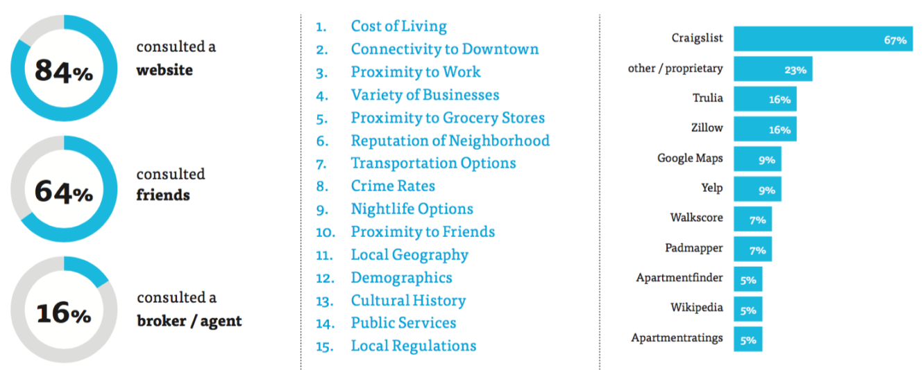
A large majority consulted both friends and websites for their decision. 84% consulted a website, 64% consulted friends, and 16% consulted a broker or agent. Many respondents consulted Craigslist.com, followed by other, proprietary sites. Some even consulted Wikipedia.org for local information.
LIVING PREFERENCES
While respondents demonstrated a range of search preferences, there was a clear trend towards cost, connectivity, and proximity to food, work and businesses. Additionally, results showed a variety in the number of preferences that respondents had: some indicated that very few variables factored into their decision-making process, while others listed close to 15 separate variables as being very important to their process.
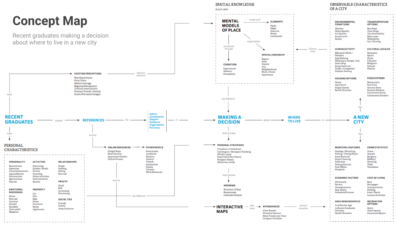
Concept Map
Understanding the complex relationships among audiences, contexts, and problem areas is critical for a designer to establish an appropriate domain of reference when creating successful tools. This is a concept map showing the relationships among a recent graduate, his or her decision-making process, and the observable characteristics of the new city.
Personas
I created four personas in order to understand a range of potential user profiles. These personas demonstrate both absolute and negotiable criteria for living preferences when moving to a new city. They also demonstrate a variety of employment or educational reasons for moving, which are important factors in determining living location. I derived these personas from the previous online survey analysis.

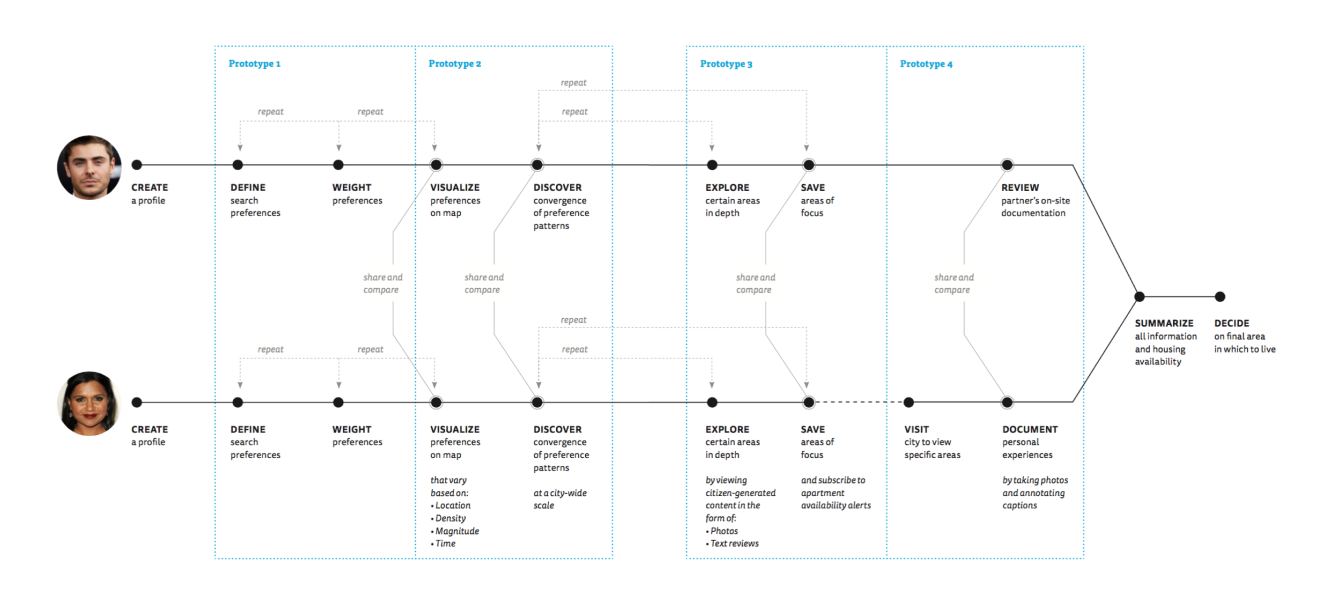
Journey Map
This journey map expresses key tasks within a user’s decision-making process and subsequent engagement with the designed map system. As many young adults make the decision with other friends or partners, I designed the system to accommodate two individuals sharing and comparing their preferences and search criteria. I have designated specific tasks within this map for the final design prototypes developed in this investigation.
Design Explorations
I began the design process for this project by completing four explorations. Each exploration focused on a key objective that was important to investigate prior to proposing and designing final prototypes. The following documents my process and reflections for each exploration.
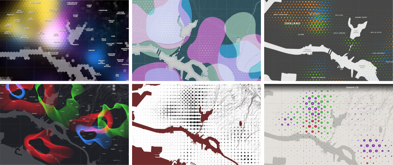
Converging Variables One of the earliest challenges in this investigation was to determine a strategy for visualizing multiple variables in the same information space. Designers and cartographers have codified various methods for plotting information on maps throughout history. Jacques Bertin’s influential Semiology of Graphics (1983) provided a foundation for data, pattern, and information visualization in map form. I found that heat maps are good for expressing both location and intensity. However they typically plot a single variable on the map. Because my focus was to combine multiple variables, I started by collecting heat maps from a few different online sources and created small studies that combined their data using different graphic representations.
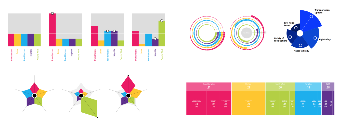
Weighted Preferences A second series of graphic investigations focused on creating formal studies that represented relative weight among chosen preferences. Taking the fixed-total principal from Thomas Saaty’s Analytical Hierarchy Process, these studies explored ways in which weighted preferences can be visualized in terms of parts- to-whole (much like a pie-chart). Above are sample visualizations that investigate the concept of prioritized variables in terms of prominence. In each study, an increase in the importance or weight of one variable results in the decrease in importance of all others.
Hierarchical Scales of Space For this exploration, I anticipated the visual relationships between the macro-, city-wide view and the micro-, neighborhood-specific view. These relationships between multiple scales are complex because certain information is appropriate at each scale, yet the viewer still needs to understand that the two representations are related. The city-wide view typically involves generalized visualizations of both place and human activity, while the neighborhood-specific view needs to show more specific data and a concrete depiction of place. I expect this higher level of fidelity includes aerial or satellite photos, as well as user-generated images and content.

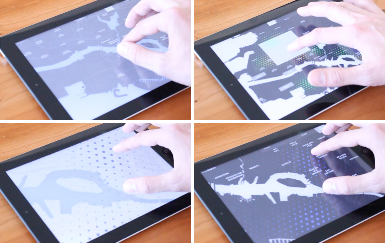
Interaction Studies For my final set of explorations, I wanted to see ways in which combinations of digital behaviors and interactions could facilitate both an understanding of the abstract representations of data as well as the relationship between multiple scales at which the system represents information. I constructed small, interactive online prototypes using Proto.io, and tested them on an iPad to get a sense of the actual size and setting in which the tool would be used.
Final Prototypes
The final outcome of my thesis questions, research, and design explorations focused on four design prototypes, each intended to support a different stage in a user's decision-making process for finding a neighborhood that meets their unique combination of preferences and needs.
PROTOTYPE 1
Articulating and weighting user-defined preferences
In this first prototype, I designed a process that scaffolds the user’s definition of living preferences. The user is presented with a list of generalized, preference categories, each related to city-living (these include “Food Options,” “Arts and Entertainment,” “Public Safety,” etc.). The user is able to enter customized categories at this time. The context-aware system is then able to prompt the user to choose or add search terms within each category, allowing the user to better articulate what he/she intends to search. A user may add “restaurants,” “bagels and co,” and “Whole Foods” under the category “Food Options.”
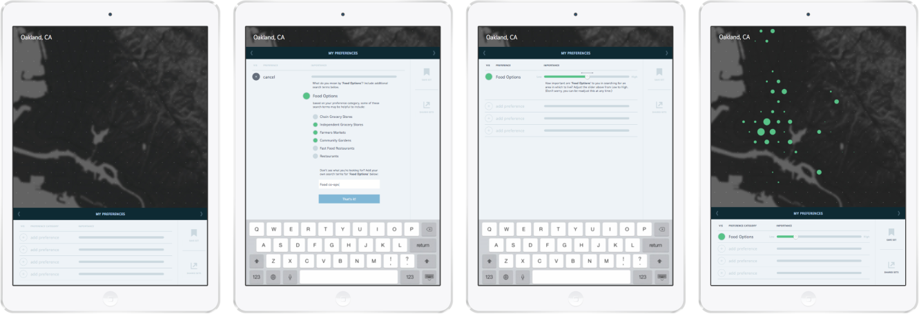
This hierarchical structure of generalized preference categories followed by specific search terms is advantageous for two reasons. First, this structure allows the user to think of each preference in both broad and specific terms. Defining specific instances of the category “Food Options” helps the user generate a variety of satisfactory choices, while at the same time recognizing that general access to food is what is of true importance. This might prevent a user from only searching for places to live near restaurants, for example. Second, this structure anticipates the user’s ability to refine his/her search preferences throughout the decision-making process to be either absolute or negotiable, depending on what is displayed on the map.
This process of refining one’s preferences by way of prompts both externalizes and articulates what may otherwise be left to internal, unstructured intuition. This externalization is vital for a user to reflect on and improve upon what is important to him/her with regards to a living environment.
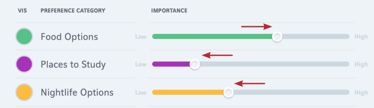
Once multiple preference categories are defined, the system allows the user to weight the importance of each one relative to the others by means of horizontal sliders. Based on the forced-total principle from Thomas Saaty’s (1990) Analytic Hierarchy Process, the increase in weight of one preference results in the decrease in weight of all others. In this way, the system forces the user to prioritize his/her preferences, providing an inherent mechanism for justification.
PROTOTYPE 2
Discovering and saving converging preferences
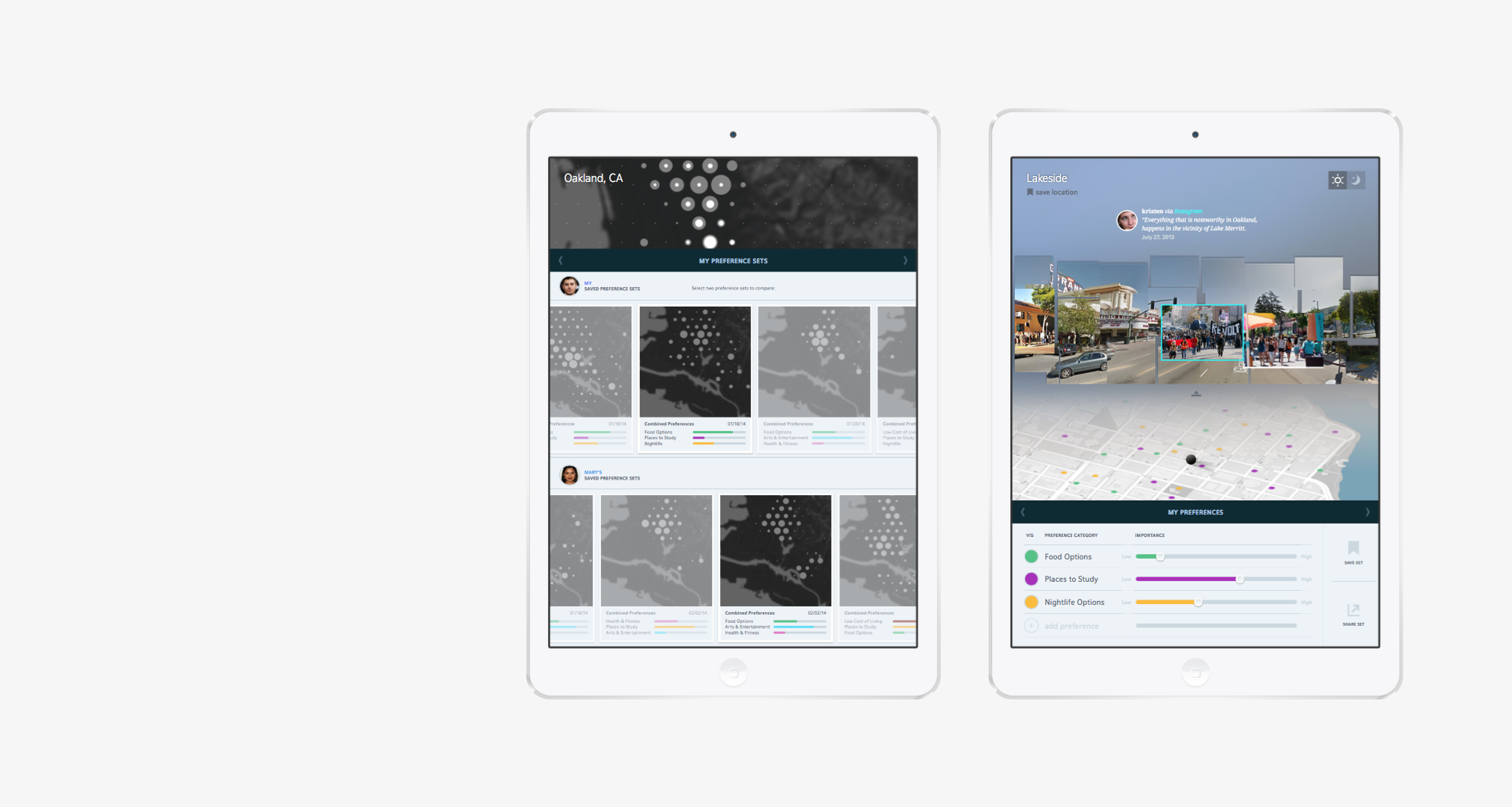
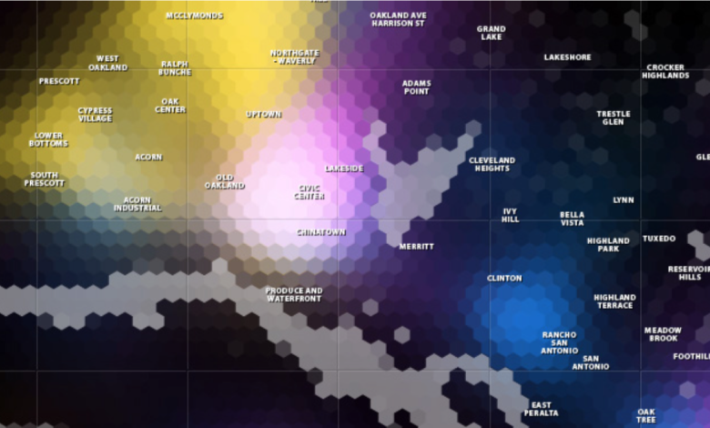
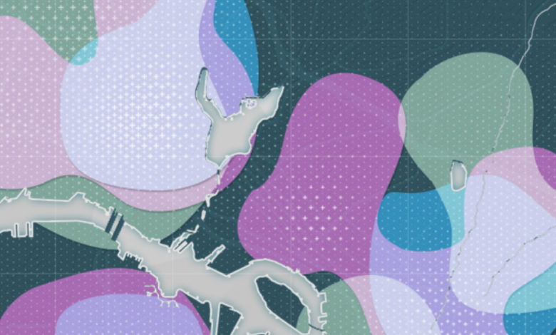
Once multiple preference categories are defined and assigned a relative weight of importance, the results are visualized on a city-wide view of the map. For each preference, areas of high correspondence to the search terms are given greater visual prominence than areas of low correspondence, creating a unique overlay pattern. Each preference category is assigned a unique color, so the user may distinguish each variable. When preference patterns are layered, the user looks for areas of greater convergence (areas with high concentration of Food Options and Places to Study, for instance).
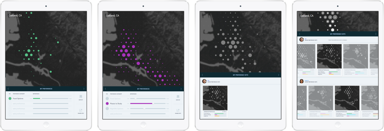
The user is able to isolate areas where these preferences converge, visualized as a neutral gray color. As the user refines his/her search terms, and reweights his/her preferences, the visualized areas of convergence respond accordingly. The user is then able to save these combined preference sets in a “card” format. These cards show a thumbnail view of the weighted preferences and corresponding areas of convergence. The user can then revisit these cards at a later date, as well as share them among other people with whom they are moving.
This exploratory activity allows the user to iteratively investigate the cause and effect of combining different preferences with the changing areas of convergence across the city. The visualization technique is intentionally general at this stage, not to mislead the user towards interpreting a simplified description of place, but to allow him/her to easily see general patterns of preference convergence. The constantly changing areas of focus on the map (due to changes in the user’s preferences) also encourages the user to delay commitment to any one area of the city in particular until multiple preferences are converged.
The similar visual treatment of distinctly different phenomena (food options and bikeable areas, for instance) remains a difficulty. There is a trade-off in visualizing all of one’s preferences in a similar manner (to aid in seeing where they converge) and over-simplifying the differences in phenomena that source these visual patterns.
PROTOTYPE 3
Exploring neighborhoods and citizen-generated content
Once the users have identified multiple areas of convergence within their preferences, the map allows for a deeper exploration of these areas. By way of a gestural zoom (pinching out with one’s index finger and thumb), the converging patterns resolve from generalized pattern overlays to points of specific location. Data that relates to the user’s search criteria is now visualized in a more detailed manner, on a refined neighborhood map showing streets and local points of interest. Specific locations are given a geographically accurate place on the map, and information about specific locales (names, hours of operation, etc.) can be accessed via tooltips.
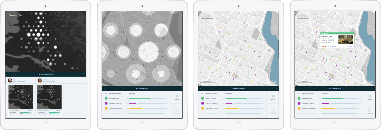
In addition to seeing how these locales relate spatially to one another, the system allows the user to view citizen-generated content about the neighborhood in the form of photos and text. At this stage, the user is able to “pull” the top edge of the map down, in essence tilting it into three-dimensional perspective. By then placing a location marker on the map, the system is able to display geo-located photos from social media sites such as Facebook, Flickr, and Instagram that correspond to the marker’s location. Rather than display these images as a grid, the system stitches the photos together into a panoramic collage, based on the direction that the marker is facing on the map. The user may either move or rotate the marker to access other user-generated panoramic photos.
This visualization technique builds on the similar technological capabilities described by former Microsoft engineer Blaise Aguera y Arcas at a 2010 TED conference in which he describes the potential for integrating user-generated content into Bing Maps (Aguera y Arcas, 2010). While Aguera y Arcas demonstrates this capability using one photo at a time culled from Flickr and superimposed on a computer-generated street-view environment, the system I propose here recreates the environment from a multitude of user-generated photos, with the option to filter them based on the time of day they were taken. This feature gives the user opportunity to see the variety of activities (or lack thereof) that occur and are documented in a location, as well as offer new contexts in which each image can be read, due to its juxtaposition with other images in the same location taken by other people. A user might see images of a deserted street by day, but flush with people, cars and lighted signs by night, indicating the range of activity that can happen at given intersection of the city.
PROTOTYPE 4
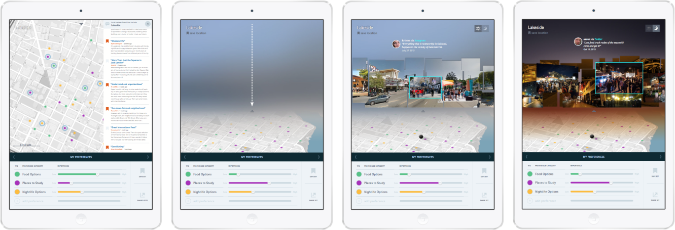
Sharing neighborhood maps and on-site documentation
The fourth and final prototype of my thesis addresses the need for multiple people who are moving together to share information. In many cases, an on-site visit is the final step towards making a decision about where to live. Previous research about a city using this system culminates in users saving specific neighborhood locations that are worth investigating in-person. These can also be saved in the form of neighborhood cards that indicate the number of saved citizen-generated photos and reviews. These neighborhood cards can be shared between multiple users who are moving together.
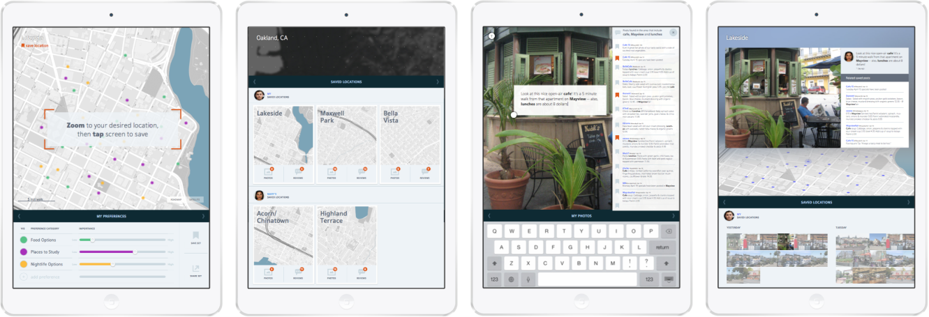
Once in the city, the system allows an on-site user to document his/her experiences through capturing images, video and text captions. Like the user-generated content used in the previous prototype, these images too are geo-tagged and visualized in relation to the user’s neighborhood-scale map. After sequentially documenting areas of the city that appear to offer an ideal lifestyle, the user is able to review his/her experiences in a more spatially-oriented manner than a typical photo grid affords.
Additionally, the system allows for multiple users to view each other’s documentation, as well as collaboratively annotate each other’s photos. This feature is ideal in cases where one roommate is able to visit on-site while the other is only able to view potential areas remotely. Rather than passively viewing content generated by unknown people to build an understanding about a particular area of the city, the roommates here use the map, photos, and captioning capabilities to actively communicate and plan. Through this activity, the users are able to confidently corroborate their previous, remote research of data and citizen-generated content with personal, real-time experiences.